Event Recap: Council for IWU Women Summit
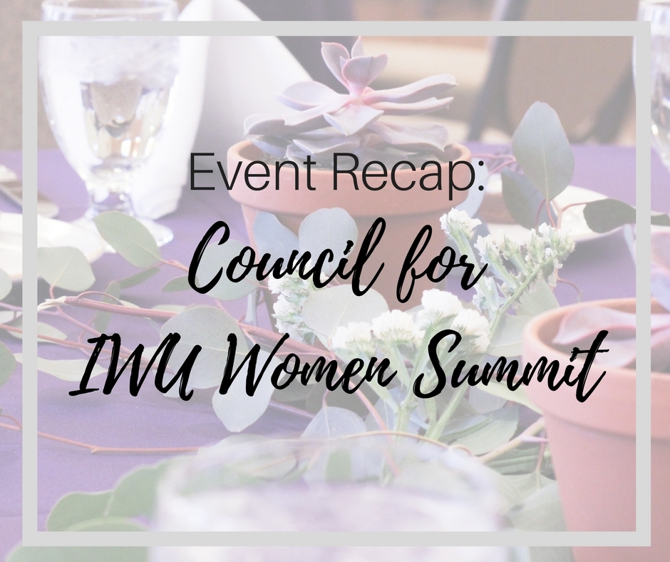
As some of you may or may not be aware, my full-time job is Event Coordinator in the alumni office at Illinois Wesleyan. I LOVE my job. Seriously, we have the best team and the privilege of connecting alumni in a multitude of ways. One of our signature events is the annual Council for Women Summit. This summit is open to all IWU women - students, faculty, and staff - and provides a weekend full of inspiring networking. My role in planning the Summit has a lot to do with the event decor and catering. The fun stuff!
When I started looking for inspiration for the decor, I literally started with this photo (of course my first inspiration is food...):
I've had this photo saved for a long time, but around the same time I stumbled across it again, I was also made aware that Pantone's 2018 Color of the Year is Ultra Violet. I don't always buy into the yearly coveted colors, but this year the color just struck a chord with me, and I thought it would be perfect for our event.
Since the decision wasn't completely up to me, I put together a moodboard to share with the planning committee. (Curious about what a moodboard is and how to make one? Check out this post that explains in more detail!) I found picture of ideas I hoped to incorporate bits and pieces of into our event. Of course, we are somewhat limited by our budget, but I feel like that's just a fact of life. No matter what your budget, you can still incorporate colors and design elements that bring your vision to life. Here's what I had in mind:
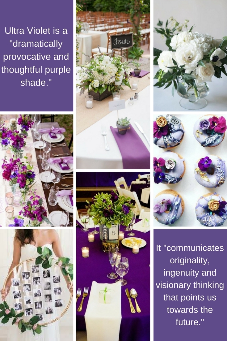
Not only did I love the overall design, but I loved Pantone's rationale behind the Ultra Violet color. It was so fitting with the theme of our event: Change. Choice. Community. Ideally, the event design should go deeper than just a color scheme. When planning, try diving into the meaning behind your design, and make each component relevant to your mission, organization - or for weddings, your story as a couple!
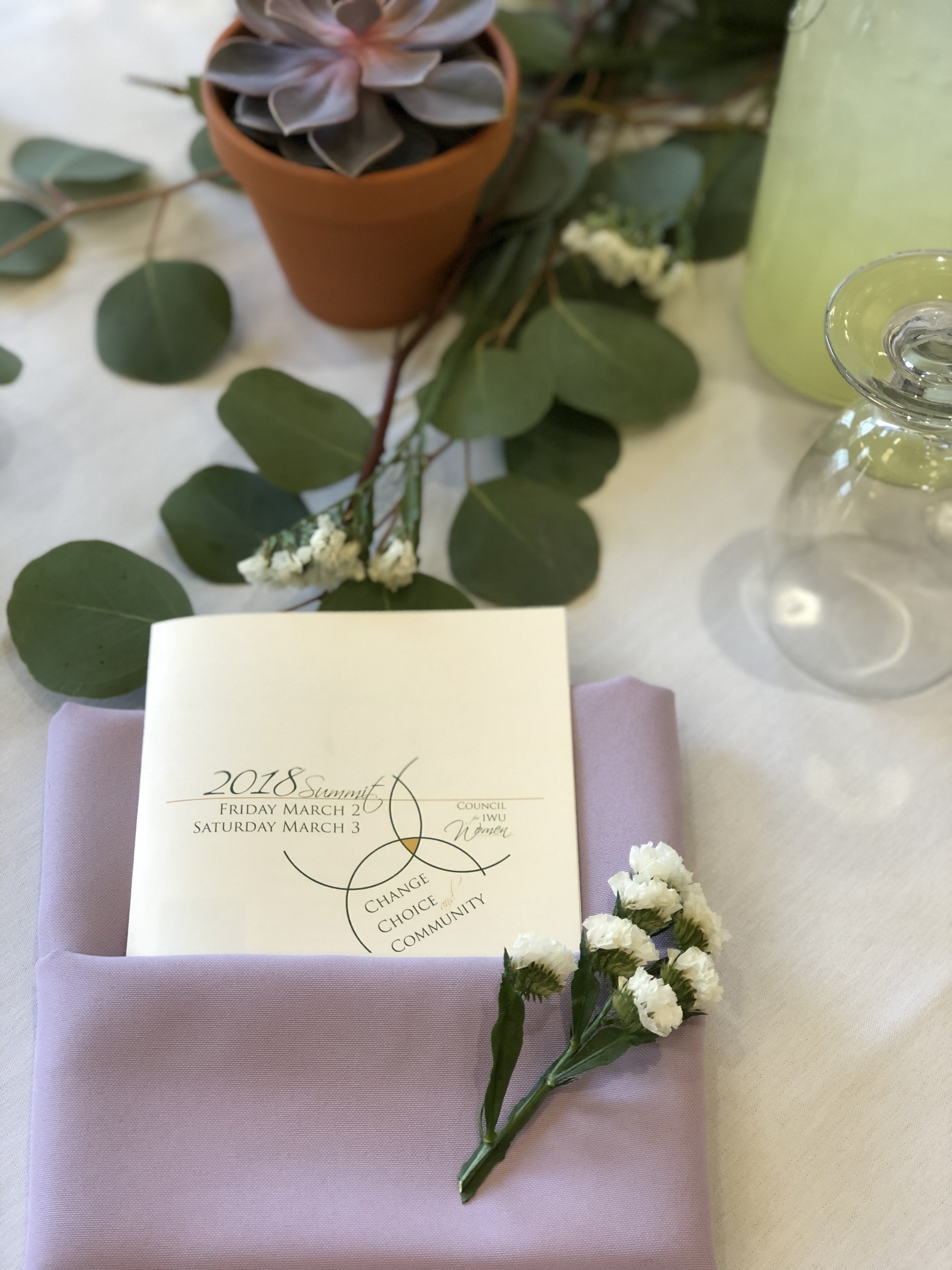
Once this theme was approved, the fun really started. First, I visited Let's Party Rentals to pick out the linens. Of course, I would've loved long harvest tables and chiavari chairs and all that trendy jazz, but remember, budgets people. These things are not necessary to create a beautiful event, no matter what Pinterest tells you (as you'll see below). Let's Party is always super helpful in talking through my ideas and brainstorming my best options. Ultimately, we landed on lilac napkins for Friday's luncheon (to be paired with white tablecloths provided by Sodexo), and purple tablecloths for Saturday's (with white napkins provided). See what I did there? :)
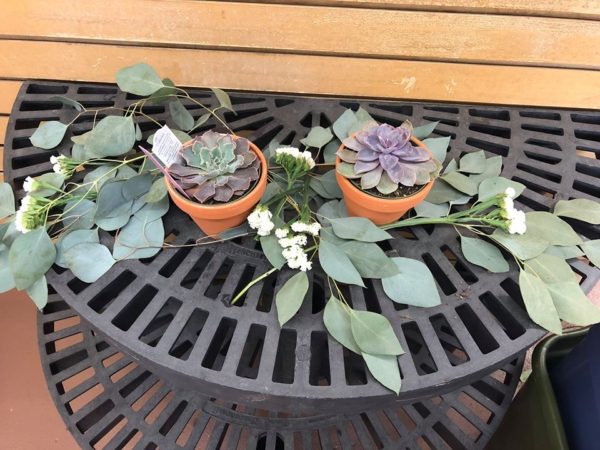
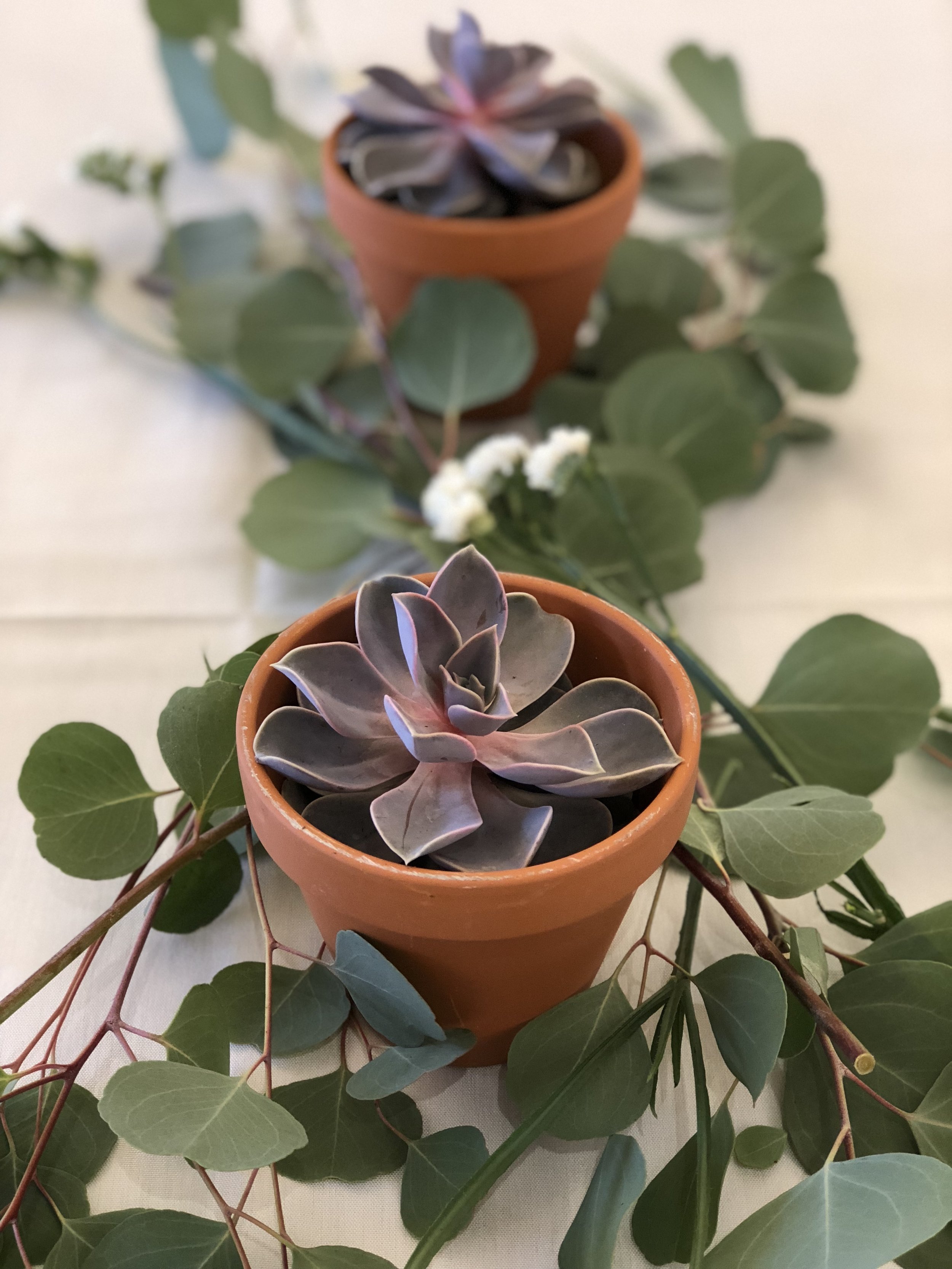
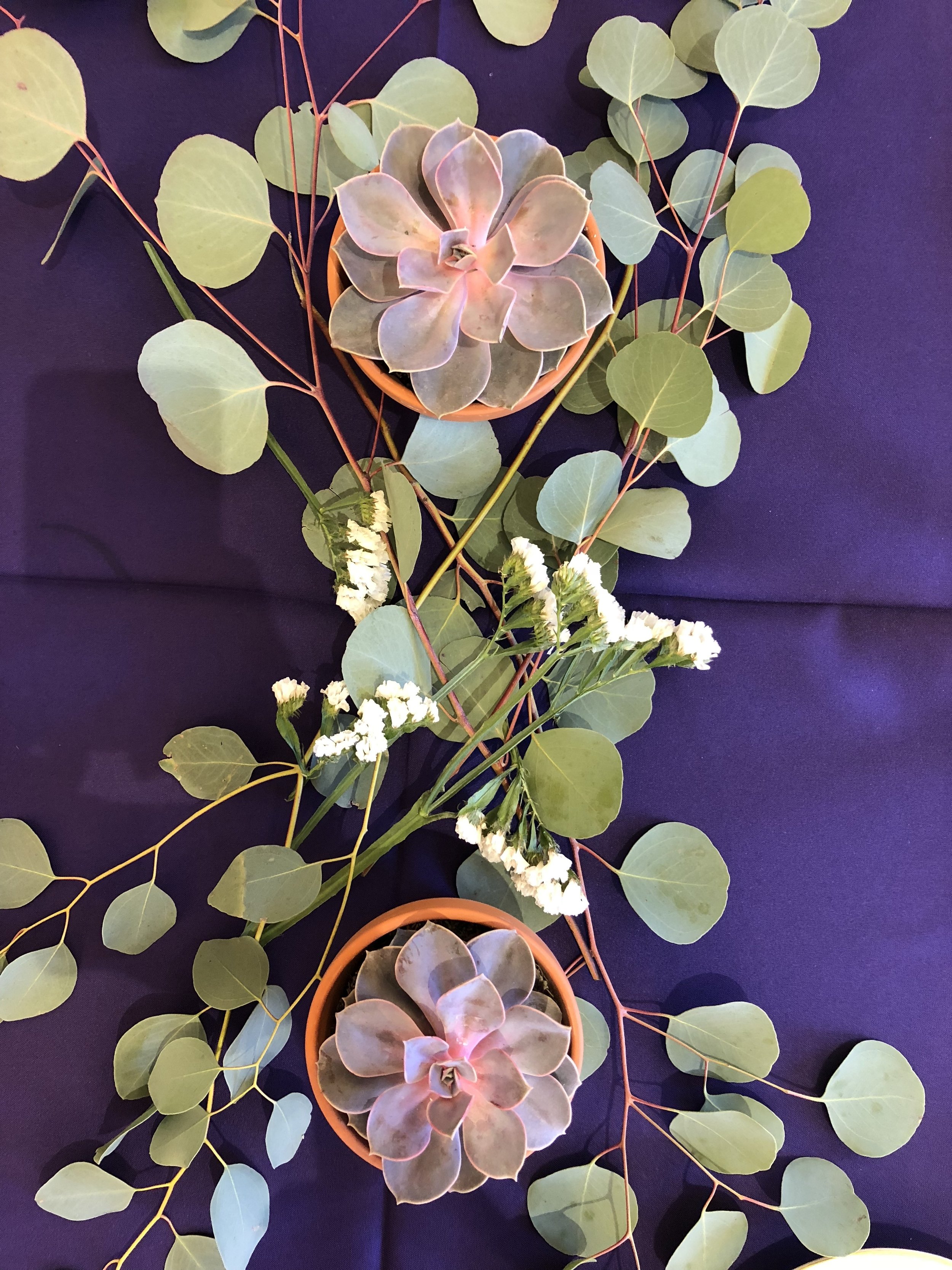
Then, I visited Casey's Garden Shop to talk about our centerpieces. I knew I wanted white and green floral arrangements, something clean and simple since the purple was really the star of the show. Julie at Casey's helped me envision my ideas by putting together a quick arrangement with eucalyptus, potted succulents, and little white flowers (formally known as statice). It. was. perfect. I was so excited to see everything come together!
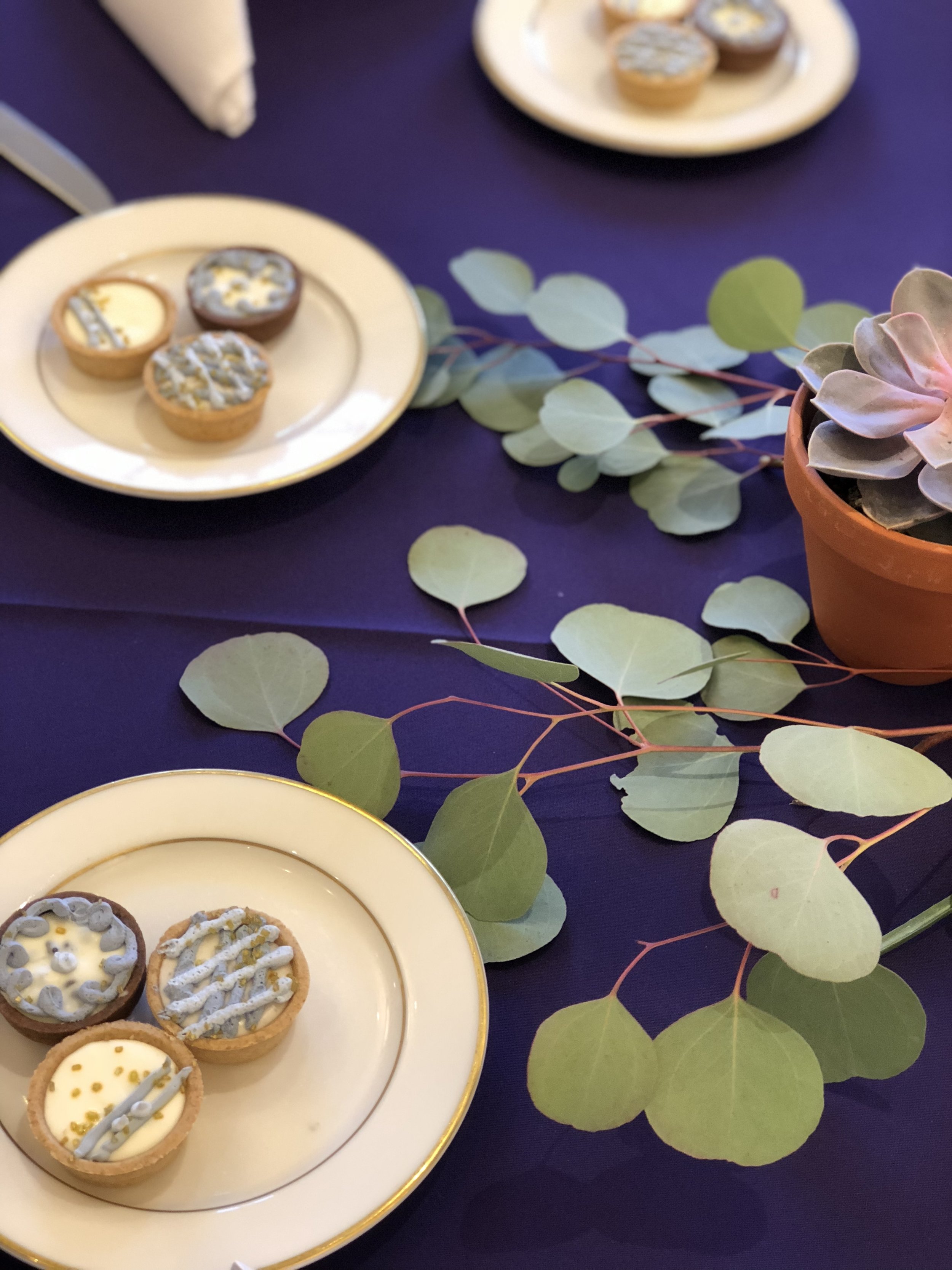
So let's get to the best part - the final product! The Summit started with a kickoff luncheon on that Friday. That morning, Casey's dropped off the greenery, then my student worker and I carefully pieced each arrangement together. We discovered after working with the eucalyptus for awhile that it has a gentle smell, and we loved that little added element to the space. She also had an awesome idea to use the leftover eucalyptus/statice stems as extra little details on each napkin. Look how adorable it turned out!

Notice how the tables are simple and not over-crowded? You might think you need to cover a lot of surface area on your table to make it look full, but think about it. Once people have their plates and drinks on the table, it really fills up quickly. On Saturday, we kept the same centerpieces and just switched the linen color scheme. Honestly, I prefer the look of the purple tablecloths with the white napkins. I just think it heightened the overall feel of the event, and I liked how the centerpieces popped on the purple.
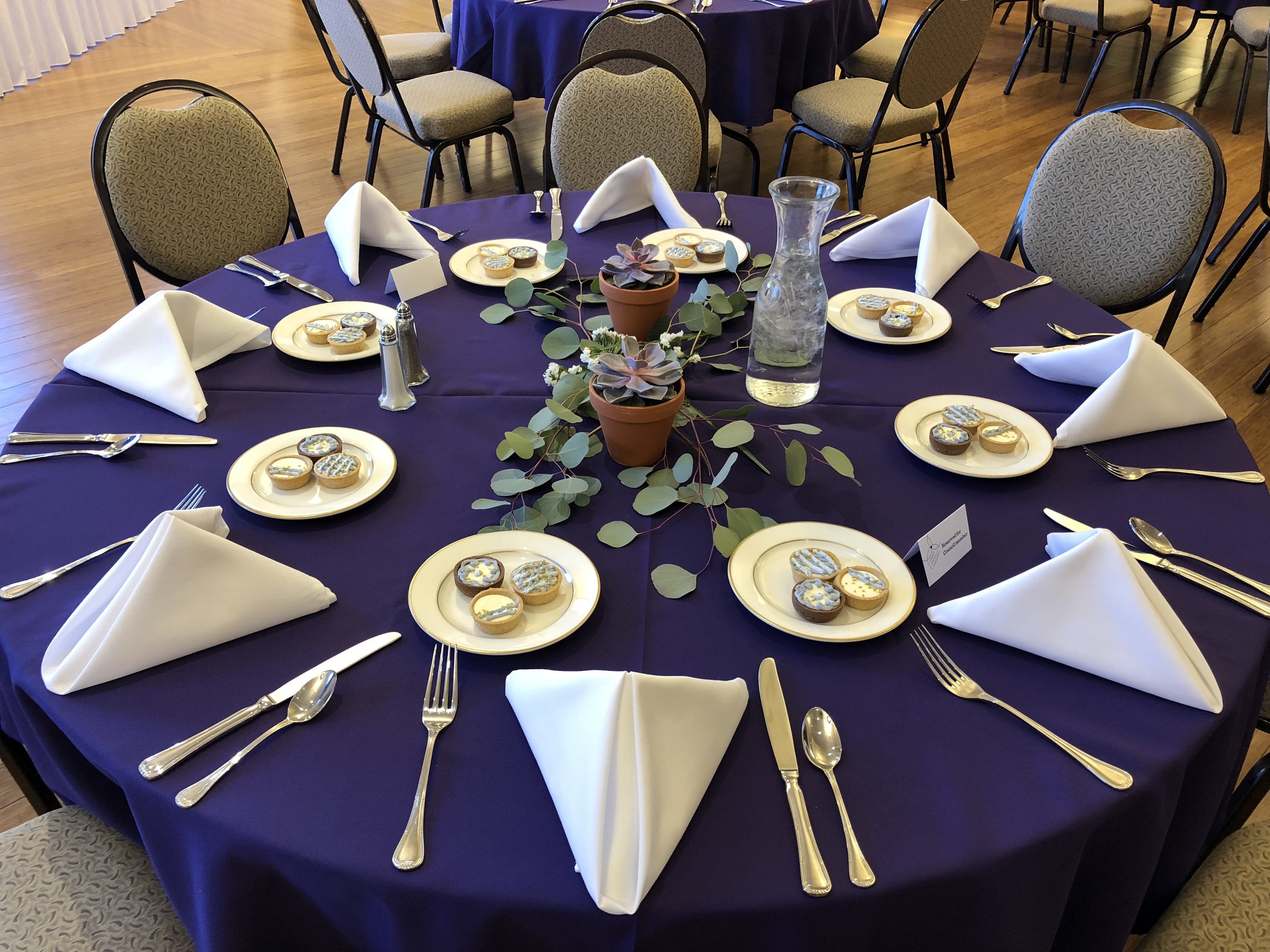
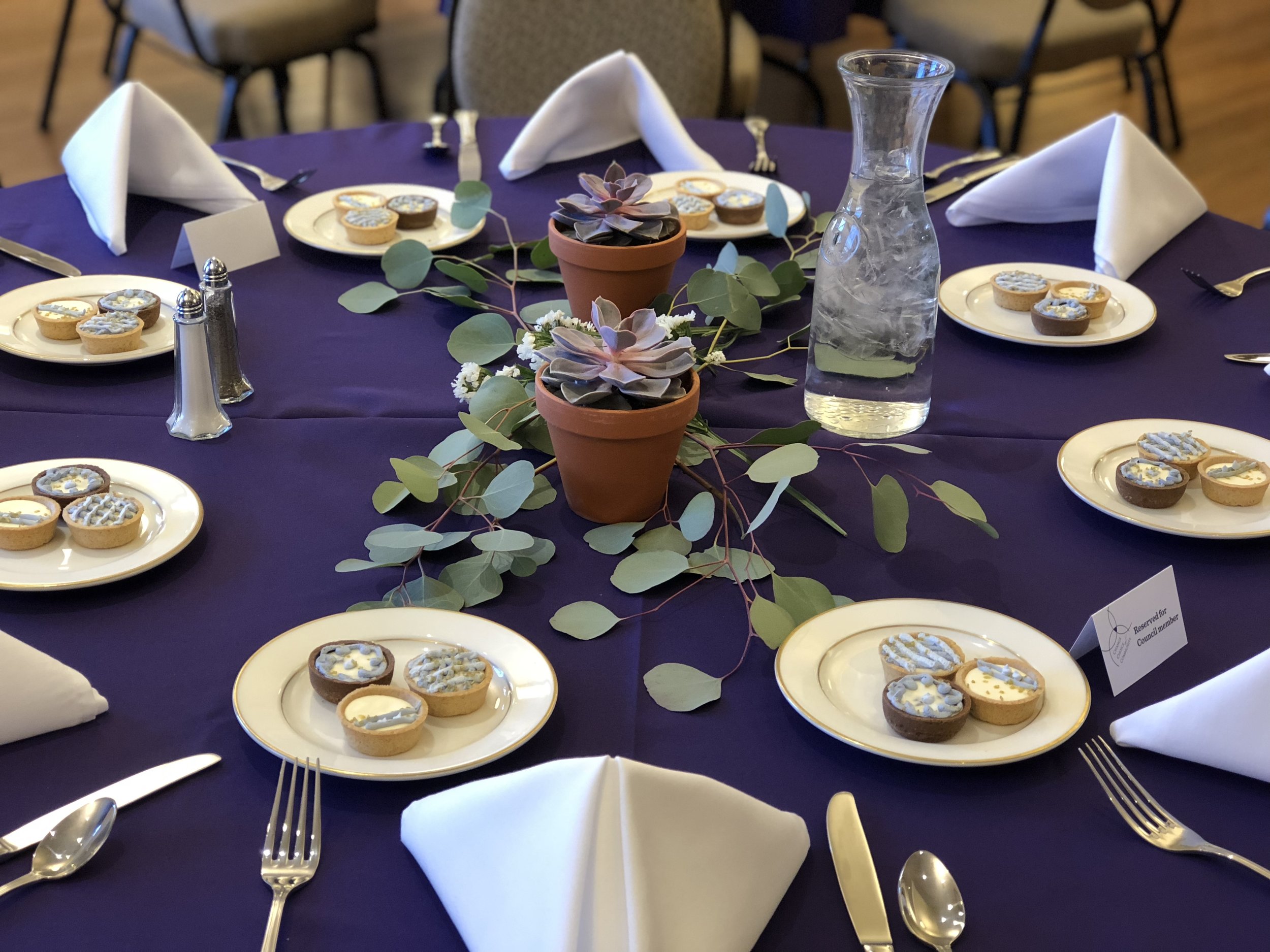
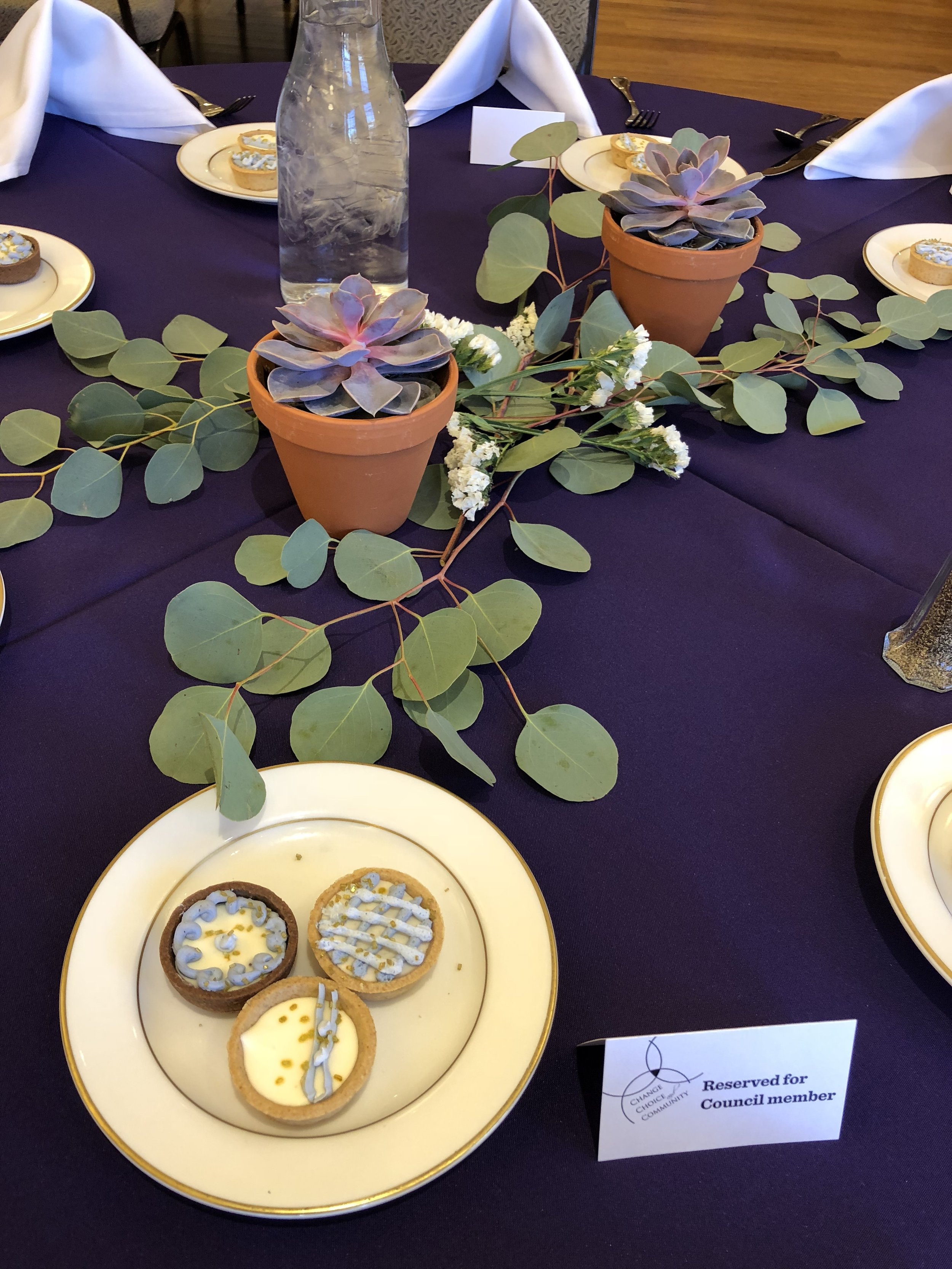
I LOVE when the food and drinks play into the decor. Actually, I think it's essential to an event, and there's a story behind these little cheesecakes. My original plan was to replicate the beautiful donuts complete with real flowers and everything, and Sodexo actually did create some samples for me based off that photo. But when it came down to it, the taste of the donuts themselves didn't wow me. They were good, but they didn't feel event-worthy to me.
So we decided to change directions and go with mini cheesecakes that incorporated the same details and color scheme. I didn't see these until the day of the event, and I was super happy with them! Words to the wise: seek out awesome caterers who will listen to your (sometimes crazy) ideas, be open to your feedback, and create a final product that meets your needs and vision.
This is such a special event, and I'm glad I get to play a part in planning it. If you have any questions about the event details, or need recommendations for vendors, feel free to send me a message!
xx,
Sara
P.S. These are just my iPhone photos, so the quality isn't amazingly blogger worthy. But I promise to work on it for future posts!